
Introduction to Digital Design
Ken Comer was an undergraduate university student enrolled in Intro to Digital Design for the Spring 2023 semester. This website was an assignment for that course. Below are blog posts detailing Adobe project assignments from the same course. Have fun paroosing!
Distress/Aging

Original Image
Retrieved Items

Tissue Paper texture

Photoshop File Screenshot


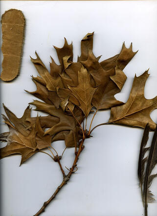
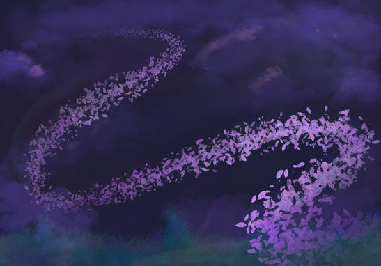
For this project, the textures I scanned came directly from items I found outside earlier that day. A feather, a branch of leaves, a piece of cardboard, and plastic trash were all scanned. Of course, the scanner was given a good cleaning afterwards. Not every piece I collected was used in the end, but I'm happy with the results. The main textures visible are crumpled tissue paper and a ripped open fruit snack gummies package (which I neglected to save the file of), put on a luminosity layer for an old "laminated" look. I wanted it to look like someone uncovered an old fabric print that had been tossed in storage.Reminds me of the flags my dad used to hang on our windows as curtains when I was little. They'd always be washed out as if he'd owned them for years or more, but I felt like there'd always be more each time I looked. Like weeping angles.

Final Product

Symbolism: Ivanuska
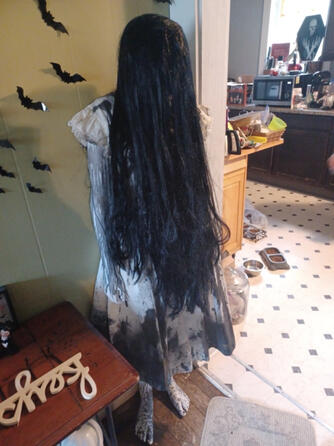
Sadako Mannequin

Grimoire and Archimedes (Squishables)
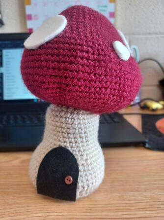
Mushroom House
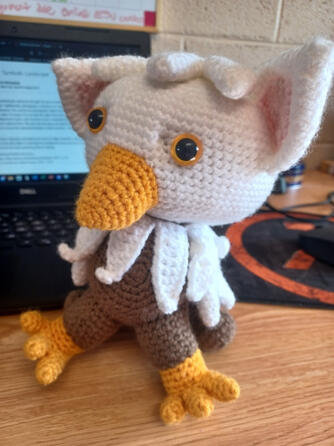
Crochet Griffon


Lemon Demon's song, Ivanushka, is about the titular character form 1964's Russian film Jack Frost. Our caged bird is meant to represent the beastial speaker who is infatuated with and/or sexually objectifying a woman named Nastenka, represented by the crochet Griffon. However, "Father Mushroom" and "Father Frost" (the fairy house and Sadako Yamamura) are forces keeping the creature at bay. Grimoire and Archimedes represent the music itself, as Ivanushka's instrumental was later rehashed by Lemon Demon to create the far more popular tune "Touch-Tone Telephone." Grimoire's point of view overlooks the entirety of the dark scene as the first song does, while the oblivious Archimedes faces the toys/novelty of the enclosure, representing the features taken for the lighthearted revamp.

David Traylor Zoo of Emporia

Photshop File Screenshot

Final Product


Drawn in Illustrator

Original Image

Illustrator Posterization Trace

Work in Progress Screenshot

Final Product


In all honesty, my dear Mary Todd (pictured) was not my first choice in subject. I wanted to choose a more complex figure (a very sweet image of my romantic partner), but due to my skill level at the time of creation that simply wasn't an option if I wanted to turn the assignment in on time. However, I'm not upset with the result. I learned some techniques to assist with the process and general use of the program along the way. What helped me the most was changing the workspace from "Essential" to "Painting" while allowed me use of a brush tool that I could still edit with the pen tool if desired. The feel I was going for was satirical obituary, as she has long since deflated and her remains have been unceremoniously tossed out. Her ride-or-die attitude and horrible cataracts will forever be missed.
Self Promotion
Using assets and concepts from previous projects throughout the years, I compiled a double-sided post card for a fake exhibit. Funnily enough, I spoofed it off of the "thanks for stopping by!" business cards I printed for the actual venue I will be attending later this week. On April 7th 2023 I will be selling digital art prints and monster high sculptures. (Edit: I attended the venue, and while I didn't make much of a profit, the vibe of the place was nice. My close family came and took me to dinner. It was an alright night.)
Landscape Background

Artwalk Card

Card Pile Printed and Cut


In terms of the work I did for this project, I took a previous illustration I drew and made that my front page, knowing the top right between the clouds would make for an aesthetic area to put text. Mahou Wando is a fictional universe and collaborative art group created by artists on Toyhou.se and DeviantArt. Making assets for my characters within that story has been one of my favorite things to do since starting college, as the diverse cast and sandbox world allow for incredible flexibility. My characters live within the Blooming Lighthouse, which is why the name of the exhibit is subheadered as "Lighthouse Legends." I'm a big fan of alliteration.

Mahou Wando Lighthouse Illustration
Illustrator Layers

Final Product


I believe these promotional materials represent me as an artist because I love looking back on my old work! Expanding upon ideas I had as a kid, or remaking ideas I've had recently into something new, is a real good way to make sure I take everything I can away from a concept. Advocating for yourself, especially as a small business entrepreneur in the modern, stead-fast art world, is incredibly important. Don't feel shy about sharing your work, no matter how old it is. Stay proud of what you do!
MASKED: Text & Image

Background Research (pg 1/4)
2004 anti-film piracy ad campaign

Right Hand Reference
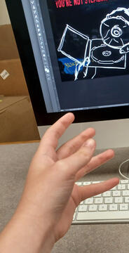
Left Hand


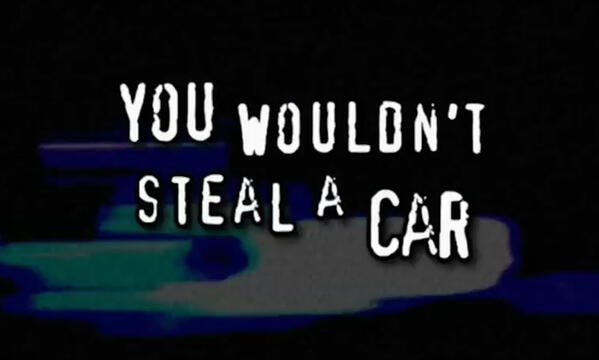
After investigation regarding the diminishing free market of the online world, I've taken side with the fact that I believe under a certain set of circumstances the torrenting of films and other media is justified. The extortionate prices of streaming services, the working conditions of the studios those services fund, and the lack of compensation handed to the people behind the content on streaming platforms are among the list of acceptable reasons to stay away from supporting the platforms, instead choosing to ethically pirate. Popularly ridiculed "you wouldn't download a car" anti-piracy ad's aesthetic is included within my project in form of matching typeface and 2000's memorabilia to indicate a setting of 'washed-up digital garbage pile'. You can see I already sketched with google as my guide, and two extra pictures on my phone. These final ones were what I stuck with primarily.

WIP .psd Screenshot

Final Product (exported as .PNG file)


A few complications arose when it came to nailing down a style. The top section stayed consistent throughout the project, but I wasn't sure how I was going to fill out the dump or make a CD the center focus like I imagined. I used the typical RGB color scheme and diffusion layers to make the piece appear akin to a retro-computer or DVD player. Originally I desired a sense of action and movement that mirrored the original commercial. However, I chose to go for something mystical, quiet, and dirty to lend to an apocalypse feel.(That's why I like having CDs still. Always gotta be prepared for when the internet goes out.) The blue blob that matches the Blockbuster sign underneath the right forearm is supposed to be the R from 'Toys R Us.' I tried adding the giraffe mascot too, but he looked too silly and counterintuitive to the point of the piece.
The Domino Effect

Original, Jan 2017

Remade animated in four hours, May 4, 2023
Additional 3-4 hours, repaced and edited


My excitement overcame me for this project upon reading "illustrative" for a motion-based assignment. I'm a huge fan of animation and wanted to flex what I've learned over the past few years by redrawing my first ever animation. Exhilarated, I incidentally created something that did not fall in line with the instructions given for the 30 frame, text-included product I was supposed to create. Hastily after realizing my mistake, I grabbed a few figurines from my desk to create the actual domino effect assignment. The amount of photographs I took nearly froze my laptop rendering, so I was unable to fetch any screenshots without fear of my device's demise. Sadly, due to an unfortunate file erasure from switching devices and primary emails, evidence of that stop motion no longer exists.
Misc. Exercise

Physical Sketch

Photoshop Edit

